In what ways does your media product use , develop or challenge forms and conventions of real media products.
In preparation for the making of our short film, we had to
research different short films and to do so I know I watched many of them to
help me choose what ones I would write my analyses on. This meant that I could
see different types of genre of short film and perhaps get ideas. I think our
short film was inspired by one short film where we liked a concept then changed
it to suit us and then used it to basically run our narrative, with the fact
Eve is talking to someone who isn’t actually there.
Typical camerawork in these short films were very character
related. The shots either were close up on the characters revealing their
emotion and body language or they were kept mysterious from a distance with an
ELS/LS or a MLS. This is shown a lot in ‘DO NOT PRESS’. The camerawork is very
close and the composition of the character in lane is always very visible. This
helps show his emotions and body language on screen which fills in the absence of
dialogue in this short film. This wasn’t something we focused on in our short
film because we wanted to show that she was isolated and what we tried to
suggest that was that she wasn’t completely sure what was going on really
unlike this character who knows what he is focused on, the button. There is a
shot where the button is on the table whilst he eats Pizza which uses a focus
pull to show what he is looking at in a different unique way. We do use a kind
of close up with the two characters in the frame, this shows their expressions,
but most of the shots that we wanted to show expressions with in our short film
came from a little further distance than a close up, nearly a mid-shot for
example when they were talking by the brick wall and the shot reverse shot
showed Eve’s body language and facial expression. We didn’t use many long shots
in our short film, which we probably should have. We used long shots with Eve
walking along the road but that was it really, that established the quietness
of the area. The narrative between these two short films, ‘DO NOT PRESS’ and
‘The Black Hole’ are similar with similar quiet and curious protagonists but
they use different camerawork which shows that it can be completely up to the
creative mind. I think we should have used more long shots and close ups whilst
in the house and doing actions because long shots may show that she is lonely,
although she really isn’t because of the annoyance of the hallucination and
close ups would show more ambitious cinematography than we actually did
although I think that the composition of the subjects in the frame did fit in a
way that represented them how we intended to do. You don’t need a close up to
show an object such as the button and piece of paper with the black hole show
me from those short films. It seems here that the camerawork that we used kind
of suited the same style of these two short films, we didn’t go over the top in
long shots or anything like that but we managed to create tension and suspense
using shots that you could see everything in frame as these two short films do
whilst showing the isolation and loneliness of Eve, this is done in the black
hole with the first shot of the character standing alone by the photo copier
alone with sounds going on around him. This may suggest that he’s being left
out or isn’t part of the office crowd when in our short film there is no
suggestion that there is anyone else around because there is no sound and she
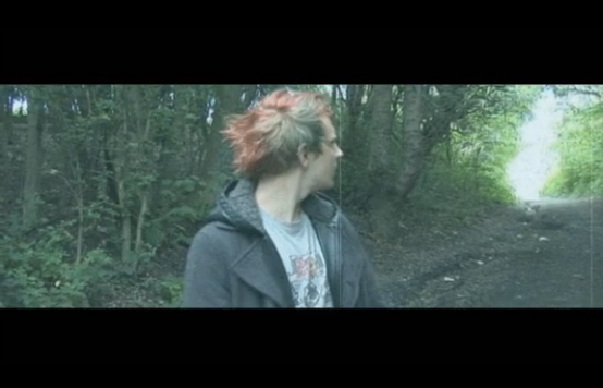
is always alone which has the same suggestion that she isn’t part of the crowd. Like Trespass, our short filmed included a few shots that were POV, this is something that we used as a way to show that they are two different characters, as you can see Eve's hallucination as Eve is walking past her.
Sound was important to us when making our short film. We
recorded sound with every shot that we took on a sound device. This meant that
we had a different copy of the sounds which were better quality from a shotgun
microphone which was pointed towards the sound which meant that sounds around
the microphone were largely not picked up which meant we could emit the sounds
of planes, and instead capture the sound of nature and silence. Capturing this
means that we could make the sound seem quite eerie with the silence and lack
of human activity on screen and off screen. I would say that short film wise,
the one that gave me the most inspiration for sound was ‘Missed’. This short
film was the one that influenced my idea about Eve speaking to a dead person
who is in her head, then that transformed to speaking to a hallucination of
her, battling her thoughts within. I think the sound shows the emotion of the
character being shown by perhaps contrapuntal sound as you can easily tell he
is having a kind of reaction to the news of the woman dying, but has a very
calm soundtrack throughout. I think some sound which may seem contrapuntal to
the situation is when Eve is standing by the car dancing to the song on the
radio that she had discovered because she is alone in the world and everything
seems abandoned yet she can have fun and dance, with happy music. This scene
was important to us as it showed her feeling like she can loosen up, but when
she hears ‘Run!’ it all changes and the overall mood changes completely. I
think this is the same sort of thing that happens at the end of Missed because
the music changes and he looks up to realize that what he imagined isn’t
actually true, therefore nothing was actually calm. The characters are
completely different which means that sound can be used differently to
represent them. Our character, Eve, is less calm than the protagonist of Missed
and this is shown by her nightmare for example which uses distorted music and
laughs which are contrapuntal to the situation once again. We used ambient
sound which we recorded for minutes at a time to try and get good silence for
the short film, I feel like Missed doesn’t have to use much sound to actually
portray what happens on screen and instead focuses on the narrative and
cinematography, I feel like this was similar to ours as we didn’t use a lot of
sound but we were very picky with what we actually used such as the ambient
sound had to be quiet enough and not contain anything that would spoil a scene,
we wanted it how it was intended sound wise and had the opportunity to do so
with the amount of time and recording we did of sound and recording crucial Foleys, one that we recorded which took the most effort and time was the smashing of the plant pots, we had several that we smashed on solid ground outside.

 |
| Us whilst recording audio on set |


Ancillary tasks:
The posters that I researched were mostly portrait with the
exception of one but I believe that was for a reason. The portrait posters
seemed to have a subject or the main eye catching object in the center of the
image of the poster. This isn’t the case for the imitation game because it
needs to be landscape to show off the star name of Benedict Cumberbatch, this
means he can be a larger part of the poster without taking up so much room that
the text would over lay on his face, it gives him half of the poster instead of
being just in the middle basically. We did use this idea in our final poster
designs with the image of the subject being quite big in the poster; the images
of the characters are displayed in different ways. The final poster that is landscape
has the character laying on the mirror looking towards each other, with different facial expressions. This is large on the poster because it is given the room to be, such as the imitation game's poster has. Differently, the Rusted's poster uses a smaller amount of space with black surrounding the blue like image of two people who have been placed together, merged into an image of a room. The images are placed either side of each other on the poster, which means that they are juxtaposed, the comparison in the costume and make up of both characters so they almost look like completely different actors instead of the same person. Paranormal Activitie's film poster was an image taken directly from the film, a famous scene when the two protagonists are in bed, this isnt something we wanted to do as we couldnt find a scene or a shot in our short film which would make a good contribution to the film poster. I think they can choose this image due to the annotations that come from the bedroom scene with the night vision cameras.

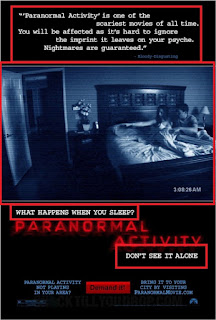
The title and the composition of the title on the film poster varies poster to poster. On the imitation game's poster, the title is placed on the left bottom corner, the rest of the left side is left for institutional details and reviews, a few words which are from a certain place which describe the film in a couple of words which are from well known places. Paranormal activities title is red and quite bold on the black, I think this is because its a horror style and wants to be dark and maybe the red colouring can connote danger. In our short film, the text and title is coloured white to stand out on the black background, but because its white and not red it perhaps shows that our short film isn't a horror and instead just a thriller, the text is also fragmented which may also suggest that Eve is broken.
These are all common conventions and we put that into place in our film poster. Another thing that we included was awards and accommodations given to the film. This would usually come with film festivals with short and low budget independent films. We chose to include this because it is a convention of short films, of course ours hasn't won any awards! This wouldn't be the case for most short films of course, but we chose to include as many conventions as we could.
Each film poster has a tagline or has a piece of text that is unique to the film or describes the film in general. For example, paranormal activity has 'what happens when you sleep?', this relates to everyone as everyone has to sleep, but is trying to mess with people at the same way as it is trying to put a twist on something everyone does every day, putting this idea in the audiences head that it could happen to them or anyone. We didn't have a tagline, although we included a quote that says 'Thrilling to the end' which may work in the same way. We could have included a tagline which related to our film directly, but we didn't. I think this could have made the poster even better and if I were to do the whole thing again I'd make sure we worked on a tagline to include. I think that our title is almost tagline like as it doesn't include much but describes our film entirely, but we could have given it more thought. I think it worked out better leaving one out in the end as it doesn't give as much away and instead we chose to keep it more mysterious with just a title.

 Overall the conventions of a film poster include an image, being landscape and portrait, a catchy and title that stands out, a tagline, awards and reviews and finally the stars that appear in the short film. We did include text to show who our actors were but the main actor of course got the biggest and most room on the poster. We tried to use all of the conventions that we could on our own poster, this I hope resulted in a poster that we can be proud of but if we were to do it again I believe we could have done it a different way.


 |
| This shows the different parts of this poster, all of these I have highlighted some things that I've talked about. |
The title and the composition of the title on the film poster varies poster to poster. On the imitation game's poster, the title is placed on the left bottom corner, the rest of the left side is left for institutional details and reviews, a few words which are from a certain place which describe the film in a couple of words which are from well known places. Paranormal activities title is red and quite bold on the black, I think this is because its a horror style and wants to be dark and maybe the red colouring can connote danger. In our short film, the text and title is coloured white to stand out on the black background, but because its white and not red it perhaps shows that our short film isn't a horror and instead just a thriller, the text is also fragmented which may also suggest that Eve is broken.
These are all common conventions and we put that into place in our film poster. Another thing that we included was awards and accommodations given to the film. This would usually come with film festivals with short and low budget independent films. We chose to include this because it is a convention of short films, of course ours hasn't won any awards! This wouldn't be the case for most short films of course, but we chose to include as many conventions as we could.
Each film poster has a tagline or has a piece of text that is unique to the film or describes the film in general. For example, paranormal activity has 'what happens when you sleep?', this relates to everyone as everyone has to sleep, but is trying to mess with people at the same way as it is trying to put a twist on something everyone does every day, putting this idea in the audiences head that it could happen to them or anyone. We didn't have a tagline, although we included a quote that says 'Thrilling to the end' which may work in the same way. We could have included a tagline which related to our film directly, but we didn't. I think this could have made the poster even better and if I were to do the whole thing again I'd make sure we worked on a tagline to include. I think that our title is almost tagline like as it doesn't include much but describes our film entirely, but we could have given it more thought. I think it worked out better leaving one out in the end as it doesn't give as much away and instead we chose to keep it more mysterious with just a title.


Little White Lies:
Little white lies is a subscription magazine which contains film reviews, ratings and overall film information. It is read mostly by people in the media industry and people with real big interest with film. This could be said because its not a cheap magazine, costing around £6 every 2 months and the quality is so good that people would often keep the copies because each copy is almost like a piece of art.
We followed the conventions of little white lie's reviews by copying the structure of the page that every review is written on. In this case it is an image at the top of the page, with 3 columns of text. The title is in the center of the page above the stars and director. There is a watermark of REVIEWS on the side of the page which appears on every page that there is a review. There is a page number at the bottom too. These conventions of a Little White Lies review appeared in ours, we pretty much used the structure to make our film review seem authentic to their magazine. This means that we had to build the page on indesign, which meant that we could try and get everything exactly how we wanted it. We didn't have enough text to fill up the whole entire 3 columns to begin with and instead we chose to leave it even though there is a small gap because this would be better than changing the text size or changing the font as this would be not correct in how Little White Lies structure their reviews.
 |
| An Annotated Little White Lies review |
In language terms, we tried to use language which would suit the audience that we were aiming for. This means we used more sophisticated language and tried to make the whole review quite pleasing to read with several uses of alliteration and short and snappy instead of long sentences that
would mean that less infomation would be transfered. It is also written very creativly, giving opinions and reviews in unique ways so it is enjoyable for the audience to read. The genre of our short film is a thriller, this can be suggeted by our review and how we wrote it so there wasnt much given away and instead keeping everything very cloudy which may create enigma. One thing that the reviews never do and that is reveal much of the narrative or spoil anything so we tried to do the same.

Question 2:
How effective is the combination of your main product and ancillary texts?
Transcript:
In our project, we created our short film with two ancillary
texts; these were our posters and film review. Obliviously these are put in
place to promote the film and not contain much or any of the short film’s
entertainment, this meaning that none of the narrative or spoilers are given
away, therefore retaining the excitement and entertainment of the film and
instead promoting the short film as something that they would enjoy to watch. The poster is important because it is a quick
way of promoting a film because you just need to look at it unlike a trailer
for example, this is usually the case for big budget films so for low budget
films and short films posters may be better because people won’t give them as
much time when they may stop to look at higher budget film poster. We want them
to know that it is a thriller whilst suggesting what it is about without giving
little to any information.
Our demographic includes 16-24 year olds, both male and
female audience for our short film. This meant that our poster also had this
demographic as there would be no point in promoting the short film for a
different demographic, therefore we had to use the same conventions as we did
in our short film to make sure it stays on the same tone, genre and perhaps
even just the expectations of mise en scene, sound and editing in creating an
image of the mood of the short film.
The colour of the surroundings of the image is pure black.
This suggests that it is a thriller according to my poster research as many
thriller and horrors consist of the colour black, this relates with our short
film as it follows these conventions, especially with lighting used and the
locations being dark inside and even when we filmed outside we didn’t want too
much light which shows that we transferred this convention over to the poster,
creating a dark setting.
Our poster contains social networking sites on the top,
which aim specifically for our target audience as they are the stereotypical users
of social networking sites such as Twitter and Facebook. This, as we were able
to gain our audience feedback, we know that this contains our demographic.
The characters are represented in a way which relates
directly to the narrative, without spoiling much and instead just representing
their characteristics and how they’re emotional states are presented, perhaps
good vs evil is what it all comes down to because they are placed juxtaposed beside
each other with clear vision of their facial expressions. These are the same
characters used in the short film, the hair and makeup corresponding with how
they are presented in the narrative with their personalities and roles in the plot.
I think the fact that we chose to give the protagonist and antagonist roles to
a female may help target our demographic as it has a variety of conventions and
how it represents them as a strong female as well as a female overcoming a
problem. The cast also consisted of similar ages to our demographic which may
help them relate to the short film too.
The target audience is very different than our short film is
actually aiming for, this means that we should have probably changed the
opinions of the review and suggested why they had that opinion instead of presuming
that our demographic would read it, I think this is something I’d change if
given the change to do it again. Our
review was made to give a review of the short film to an audience that buys a
magazine every 2 months containing many reviews and segments which would
interest film viewers with not many ads due to the substantial price of the
magazine, which may make the magazine more targeted at people with very high
interest in film since. Although people may be older who are interested in film
and work in the film industry, they will still enjoy a film because of the
cinematography and enjoy that aspect so they may fit into our audience since
they just enjoy film. A review would appeal to the audience of a film magazine
because they would like to see how a film has responses from different people.
The review targets the demographic that Little White Lies
Reviews has is dedicated film lovers, usually working in the media industry or
just a very strong interest in it. The first thing that you can tell that we
were trying to sound and copy the style of the usual Little White Lies, by
using a lot of long words such as this sentence at the beginning of our review. This means someone has to be educated to be
able to read or perhaps educated to even enjoy this type of text. They would like to know films that the review
goes in favour for because they would want to watch it, this promotes our short
film. With a poor review, people will have less motivation to go and watch a
short or low budget film, but will sometimes still have success with people in
its demographic and instead do poorly with people who it isn’t targeting .
Film marketing with these kinds of low budget films and
short films may make use of film festivals. This is shown on our poster, like
the magazine, perhaps this audience is suggested to be very interested in films,
therefore a very minimal audience is being targeted when taking your film to a
film festival but getting an award from a place such as festival can help
promote your film to people who like film and perhaps even people who it doesn’t
target. The film review would help our film gain attention with the positives
and because it would be placed in a popular magazine which is only truly bought
by people with creative interests, therefore perhaps expand our demographic if
positive.
Question 3:
What have you learnt from audience feedback?
We collected audience feedback through our whole project
stage. We researched in the planning phase, production phase and all through to
the post production phase. Some of the responses we took and altered our own
work due to the response but some admittedly we chose to not stray away from
the original idea too much due to over complicating things.
To collect our data we used different ways to do this.
Pretty much all of it was online, be that messaging services and survey
websites which we could use such as straw poll, which we could send the link to
loads of people who fit our demographic to give us a quick answer by ticking
the box which they liked more. This was ever present in our decision making throughout
our project; this helped us understand what people wanted. For example before
making or planning our short film, we wanted to know what type of short film we
should create. We had an idea of a short film set in an apocalyptic setting but
nothing dangerous being the subject such as zombies and instead having a unique
narrative such as with Eve and her hallucination, but before we chose to do this,
we wanted to know if the setting interested our demographic or if it was too overdone.
In the end I feel like this helped us craft two narratives which ran next to each
other in our short film, as Eve is trying to get home through this abandoned
land which isn’t given much detail but we do suggest that there is hardly any
presence of humans but is also at the same time battling with herself within
with her hallucination popping up to send her into an emotional spiral. This
was all achievable by audience feedback as it gave us the confidence that we
were heading in the right direction with our short film and we could play with the
narrative to make it unique.
Our demographic is 16-24 year old people, both female and males.
This allowed us to figure out what our audiences would like and then we could
ask our target audience questions and survey them on what they like and dislike
so we could hopefully improve our short film to be more successful with people
that it aims with. This audience is easy for us to find especially because of
our age as would have friends who are this age therefore part of our
demographic. Of course we didn’t just want to ask our friends so we did put our
surveys out a little further to get an idea of what general people in this
demographic may prefer. Of course we couldn’t do a mass scale survey but we
managed to get friends of friends that we didn’t know on a personal level to
give us information and their opinions which may have made it fairer and more
trust worthy because they may have been more honest. We tried to ask as many
people as we could to use the whole of our demographic, so people between 16-24
years old and both males and females we would ask therefore we didn’t ask the
same people over and over which would have made it unfair as an example of their
opinions as it would be one person’s view.
 The name of the short film which ended up being ‘Second Self’
was chosen by a large amount of people that we asked so we chose to go with that
as everyone was also in agreement and audiences seemed to prefer this to all
the other titles such as ‘Alter Ego’ and ‘Gone’. Our original title was ‘The
way home’ which the audiences didn’t like so we had to change it to suit them,
this was what we referred to our project whilst in production and planning and
early into post production as was honestly just a name that we could call it
until we chose the final title, which was heavily influenced on our audience
feedback. One of the people we asked gave a detailed answer which was
interesting to see the reasoning behind their opinion, saying ‘without being
too direct and straightforward’ such as some of the other names that we had the
on the list of suggestions like ‘Hallucination’. Basically ‘Second Self’ doesn’t
give many details away but at the same time suits the short film and ‘captures
everything it should’ in the narrative and overall mood of characters and
general short film. So here in with the title we changed it because our
demographic preferred something else. This means that we tried to fulfill what
our demographic want and would like, targeting our audience.
The name of the short film which ended up being ‘Second Self’
was chosen by a large amount of people that we asked so we chose to go with that
as everyone was also in agreement and audiences seemed to prefer this to all
the other titles such as ‘Alter Ego’ and ‘Gone’. Our original title was ‘The
way home’ which the audiences didn’t like so we had to change it to suit them,
this was what we referred to our project whilst in production and planning and
early into post production as was honestly just a name that we could call it
until we chose the final title, which was heavily influenced on our audience
feedback. One of the people we asked gave a detailed answer which was
interesting to see the reasoning behind their opinion, saying ‘without being
too direct and straightforward’ such as some of the other names that we had the
on the list of suggestions like ‘Hallucination’. Basically ‘Second Self’ doesn’t
give many details away but at the same time suits the short film and ‘captures
everything it should’ in the narrative and overall mood of characters and
general short film. So here in with the title we changed it because our
demographic preferred something else. This means that we tried to fulfill what
our demographic want and would like, targeting our audience.
The majority of people thought that it was a good piece of editing and as
we thought this was able to be successful on shoot we decided to go ahead with
it and try and be ambitious with editing and shooting. The audience here gave
us confidence that if it worked it would be good post production work and work
well with our narrative therefore we could do what we intended to do with the same
actor with two characters idea and bringing them into the same frame which may
make the characters seem more believable.
 |
Once we had our film synopsis, we got good feedback but also helpful
things people didn’t like. This helped us develop our film idea and script to
suit what people wanted. We cut a lot of our script to try and cut some of the
past flashbacks and instead focus on the present and how Eve is coping at the
time that it is set instead of why she is like she is using these flashbacks as
we had several comments which suggested that we had made it far too confusing
for the audience to follow. Once we had done that we felt like we had then
sorted the confusing parts out of the narrative and film synopsis which meant
that we could focus on how we can present the film visually to escape any more
confusion, only showing one flash back which happened in a dream, you see Eve
wake up right after having this experience with a filter making the screen red
and laughter showing that it isn’t real but could be contrapuntal sound since
it wasn’t funny at all, instead we tried to make this creepy. This I hope made it clearer that there was a
flashback/dream sequence to the viewer since we had several people in planning
and research say it may become confusing.
Dan
Mongardini on the
synopsis: Good, I like it. The Distant past is confusing and it all seems a bit
cheesy.
After completing the rough cut, we were able to present it to people and
ask them for their opinions. It showed us that we were heading in the right
direction although we knew that there was a lot of work to do with editing
because of the amount of shots and cutting we had to do especially with the
special editing effects such as the two shots with the same actor in them and
syncing diegetic sound with the video such as the audio we recorded alongside
the video. Knowing we were on the right direction, we could focus on tying what
we had done in production together without really adding much more other than a
title, at the time.
Another piece of feedback we got was more detailed and explained exactly
what they thought. It suggested that our actor was good at performing and gave the
character over well, even though this is none of our work except casting. It
suggests that some of our shots were unclear and that they got confused about
the two shots with the two characters in frame and took extra thought to
understand what is going on. At the time there wasn’t much we could do apart
from try and make it clearer that they were both different characters by giving
them more screen time to define that they were completely different. The POV
when she is walking around the corner with Eve’s hallucination is sitting on
the wall is a clear indicator that they are different personalities. They
commented on how the footsteps were unclear in scene 6, so we chose to up the volume
of that so you could hear it better but not over exaggerated to make it
unrealistic as we wanted to keep our realism as much as possible.
Luke Forster
on a rough
cut: I like the premise. Couple of patchy parts still needs some work.
AS Film Crew on a rough cut: Good intro. POV in
scene 5 unclear. I thought they were the same person. Takes time to figure it
out. POV in scene 6 (ceiling footsteps) also unclear. Enjoyable. Good
performance. Looking forward to the final polished version.
So overall, we used the audience feedback throughout our
project to change and adapt our short film to suit the demographic that we were
aiming for. We set out on fulfilling what our demographic wanted instead of
purely what we wanted and used the feedback to make things much clearer. We
took evidence of most of the audience feedback we did but obviously some of it wasn’t
recorded as we forgot or it just wasn’t possible at the time. I feel like the
audience feedback strayed us into the right direction and allowed us to make a
product that reflects our demographic.
Question 4:
How did you use media technologies in the construction, research & planning and evaluation stages?